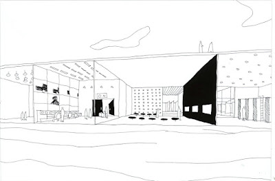


(images above are of the 3rd prize winner from the white house redux competition that took place last year, run by the Storefront for Art and Architecture)
They are beautiful, energetic, and reflective of our ever expanding and interconnecting global society. I have to admit that I have been somewhat possessed by this mode of communication, and gain much satisfaction in laboring away at such constructions. But I've also come to realise the excessive exhaustion of the whole process, and it's limitations in story telling. The reason I say this is because the whole infatuation is a relatively isolated mode of communication. When it comes down to it, the only people that are really going to appreciate one's efforts of drawing up pages of complex diagrams are architects and architecture students, and not the lay person. Thus perhaps complex diagrams are almost as esoteric and egotistical as an architect trying to use Deleuzian philosophy to design a building. (and I say almost because I appreciate the value of good diagrams that inherently attempt to represent a rigorous design process/ line of thought, as opposed to irrelevant representations of differential geometry).
The whole diagram pandemic really took off when OMA/REX did the proposal for the Seattle Library, and was presented at 'TED talks'. But the development of this application within the architecture profession has mutated into something that has lost sight of it's fundamental purpose. Which is to tell a simple story.
When it comes down to it, if you want to sell an idea, and more relevantly, sell it to a wider public audience, you've basically got to communicate it in 30 seconds. For this reason, perhaps a more relevant medium lies within the age old wobbly hand of the architect, the hand drawn sketch. Obviously, it's nothing new, and it was probably how mankind first communicated instructions for building, but there is a relatively new trend of architects mainly in the Netherlands and Japan that are pushing sketches in a new direction. These drawings speak of activity, inherently present a spatial implication, and most importantly are as user friendly as a toaster.
What's more is that 'sketches' are a 'soft' medium for selling an idea. When presenting an idea to a client, a hand drawn sketch will portray a sense of flexibility and openness, that leaves the door open for clients to access, give feedback, and comfortably engage with a proposal. The details of 'things' are no longer scrutinized and instead, the essence of an idea becomes central to the conversation.
So with that overly exhaustive preamble... we're going to do a series of posts on simple, playful and punchy architecture sketches. First up are the sketches of SANAA.

The image above is a drawing by Ryue Nishizawa that was part of a proposal for De Kunstlinie’ Theatre and Cultural Centre. According to arcspace.com the drawings was
"part of a process toward discovering and illustrating a continuous set of rooms where there is no hierarchy and no apparent structure. There is no difference between structure and partition or circulation and program. The differences come not from spatial characteristics but from proximity to water, light and adjacent rooms"


(Sanaa images from 'Kazuyo Sejima + Ryue Nishizawa/Sanaa: Works 1995-2003')
These drawings are startlingly simple, but perhaps what's even more impressive is how the built realities of these sketches are really not 100 miles away from the original conception. There is a mind boggling purity in the transition from drawing to building that underlies Sanaa's philosophy.


(image from http://www.e-architect.co.uk)
p.s I'll never stop diagramming....
No comments:
Post a Comment