The Age old 'New' in Architecture


In our relatively short modern history, architects have been constantly searching for mechanisms that promote a 'NEW' Architecture. The most significant event of course was the quartet led 'Modernism'. And subsequently, it's failure has left us in a crisis where we have been seeking to re-position architecture onto that golden pedestal, sandwiched under the glass ceiling.
The fact is, there's always so much talk that promotes the 'New'. Whether it be new modes of living, new methods of design process, new techniques in digital fabrication, there is undoubtedly no lack of architects promoting the 'new' without any convincing substance or social relevance. But last Friday night, in the cosy confinements of the Maidment Theater, I listened to a chap slowly unravel his radical ideologies that for a change, has in fact been realised, and from what I can gather (because the photos of his mass dwellings were always devoid of people) is, or will have a signficant effect on the social and built environments. Putting aside my subjective opinions on whether I felt his designs and spaces were morally or aestheticaly good, I put my hands down to the level of commitment and conviction he devotes to his work.
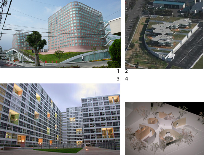
Particular favorites were his 'Fussa City hall',(1), 'Namics Techn0 Core',( 2), Shinonome Canal Court(3), and dragon lily's house(4),
Whilst the first two projects stood out for the rigor in a design that spawns from one structural system that runs integral, the latter two perform as projects that intimately deal with a social premise.
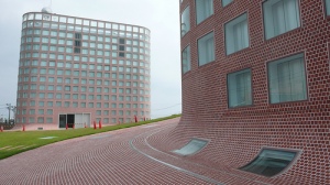
Fussa city hall stands out for two reasons. Firstly, it has a radical public groundscape that bends like a BIG diagram. And secondly, the buildings pre fabricated structural skin. The two towers that sit plump on the site are structurally constructed of a jigsaw puzzle of prefabricated concrete. It is out of this world, the walls are constructed of strips of crosses, and the floors span in rotation as they progress vertically.
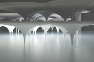
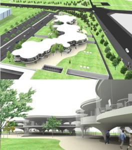
Namics Techno Core stands on a poetic notion of a mushrooms structure. And yes, this structure is prefabricated as well.
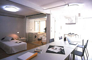


The Shinonome Canal Court was perhaps, the most socially engaging. It is a masterplan that was mediated by Yamamoto with the designs of the buildings split up amongst the man himself, Toyo Ito and Kengo Kuma. It is a model for mixed use typologies with a total floor area of 47,600msq. With an undeniable resemblance to corbs unité d'habitation, the architect states that the main feature is the 'common terrace'."Placed randomly on each floor, a common terrace of double height is surrounded with foyer-rooms. Connected to common terraces, people can use these foyer-rooms as SOHO, nursery space, or hobby rooms."
The units in the building are designed to be flexible and aimed to accommodate both residential as well as office spaces. The units are composed with the service oriented rooms (toilets and kitchen) located at the back, by the external windows. Whilst the living and bedroom are located by the entry, with flexible partition walls that can be repositioned to accommodate the office spaces. However, the most radical intervention in this project is perhaps Yamamoto's use of glass. Yamamoto uses the glass as the material to construct the front door. Thus, anybody walking down the common corridors of the building, is revealed a decent glimpse into the abodes of the inhabitants. Furthermore, the toilet and bathroom facilities are also screened off with glass. I guess you won't be taking a piss or freshening up when you've got a guest visiting your pad. All joking aside however, I personally cannot see how Yamamoto managed to sell this idea to a Japanese client IN Japan. The front door to a house in Japan holds particular significance in Japanese culture. In Japan, shoes are traditionally taken off at the front door and the floor from then on is raised. At the moment one takes of their shoes and enters the house, it strictly signifies a segregation from society. Insofar as, issues in the household are not taken outside or discussed externally to the house. For example, the father of a household that works at a trade and export office will not talk about his family's issues to his colleagues at work, and he will also very seldomnly bring somebody from outside of the family, into the house. It is a confusing culture in this respect because people do infact 'invite' people to come to their homes, but it is a figure of speech, and what is actually meant is 'we'll go out for dinner eh?'. Hence, for Yamamoto to get away with exposing the insides of dwellings within a mass residential 47.600msq project, is actually quite a big deal.
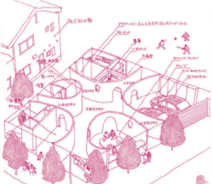
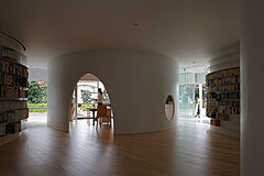
Dragon Lily's house follows a similar line of thought to the Shinonome Canal Court. This project also undermines traditional Japanese houses by basically turning a building inside out. The solid walls of the building face the center of the building, whilst all the exterior walls are completely transparent glass. All four sides of the building face onto heavy pedestrian and vehicular traffic. It's beyond bizarre, the client is either an affluent exhibitionist, or just really really likes views and saying 'hello' to the school children that walk past her kitchen window every morning as she spreads margarine on toast(because butter is way too expensive in Japan). Just think back to that scene in Jacques Tati's 'playtime' where Tati bumps into an old acquaintance from the war and is dragged into his chic modern parisian fish bowl apartment.
It's just a bit weird. Don't get me wrong, I'm all for activating street edges and I think we as a society in New Zealand live far too isolated suburban lives, but you know there are things that are called screens.
Conversely the thing that I just didn't get was the center of the building. Yamamoto was right in describing the building as a 'public building' typology. The center is an over dominating circulation core that is completely under utilised. I could understand it better if the building was shared by a multitude of familys and that this core was a 'shared' and neutral quarter, but there aren't even any bean bags to plomp a lazy bum. I'd personally just feel a bit duped if I owned the house. But hey, I can understand why it might be 'cool'.
After the lecture, something that took me by surprise was how I had not managed to come across any of his work before. The images he showed of his work were stunners, compelling, and totally down my ally. So it occurred to me as unusual that it had completely managed to slip past my radar (and I say this only because I binge on a lot of architectural porn (i.e arch daily) on a daily basis... ). I confessed my concern to a dear friend after the lecture, and he pointed out that it was probably due to the level of subtlety that underlies Yamamoto's work. As I have pointed out previously, Yamamoto is radical. But aside from his 'Namics Techn0 Core', his work is radical primarily through the 'new' social constructs he proposes in his buildings, and not because he can produce a parametric dildo in dubai. This guy really says 'f*ck off' to all the existing rules, and also probably only gets away with it due to the autocracy Japanese architects get over their clients.
Lastly, I'd like to end on one little dilema that I've toyed with over the last couple of days. Prior to Yamamoto's presentation, Andrew Barry introduced the evening with a super hot graph that described the decay and decline of Japan's aging population. This I have to say put me on high hopes because it brilliantly contextualised the architecture in one of the most pressing issues that effects Japan's current economic, political, and social context. So I thought to myself, boy are we in for a treat, Mr.Yamamoto is going to explicitly give me all the answers on how to respond and capitalize on socio-politcal issues with architecture. But no, to my grave dissapointment, Yamamoto did not pause until the very end, to explicitly address these issues. And even then it was more like... 'oh and by the way, architects have a huge responsibility in society'. However, on reflection, I've come to realise that all those answers I was looking for were obviously there. It was just that his communication on these terms were just as subtle as the radical nature of his designs. albeit... I'm too used to Jefferey Inaba being the king of Pop Architecture.... Come to think of it, he's the Alain de Botton of Architecture. Hah... but I guess that topics another day of distracted thinking.
No comments:
Post a Comment